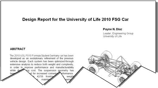
As the Design Reports for FSG 2010 come in, I am reviewing them with mixed feelings. Some are good, very good! And some are, well, not so good.
I know I have stood on this soapbox many times and have actually published (with permission) a good report once before, but it seems that new teams do not do any historical research.
First, some basics. What is the Design Report?
Simply it is a briefing document from one group of engineers (the team) to another group of engineers (the judges). Its purpose is to brief the judges on an overview of your project, your design decisions and compromises and how you achieved your aims. This is similar to the briefing you would send to a board of management if you were proposing a new project. As such it is a very important document. As the old saying goes, ‘You have only one opportunity to make a good first impression’ and the DR is that opportunity. Don’t waste it.
It is NOT a sales or marketing document, so save all the baroque prose and marketing hyperbole. Write in plain technical English (don’t use words like ‘baroque’ or ‘hyperbole’ ). Avoid obscure jargon and acronyms, you may be familiar with the terms, but the judges, most from another generation, may not. Remember, this document is a form of written communication.
In the real world, after FSG, you will have to make written proposals to your work superiors. A good rule in business is to keep these documents to one page, so accuracy and brevity is paramount. We do not limit you to one page as we understand that a whole year of your life has gone into this project and you need some room to tell us about it. The rules limit you to 4 pages of text, three view drawings on separate pages and a free page, so how should you best use of the given space.
First, do not waste a whole page on some fancy cover page as this is a technical document. A header indentifying the car number, team name and team contact details is all that is needed.
Write in an open font like Arial and in a reasonable point size, 11 or 12. This is because the judges are often no longer as sharp of vision as the students, so fancy curly fonts in tiny point sizes are hard for them to read.
The jury is out about whether the document should be in columns or written essay style. Columns look nice when the document is printed, but are an absolute pain in the butt when the document is read on a computer screen. FSG makes your DR available to the Judges as a .pdf document from the FSG website. By definition, this means it is going to be read on a computer screen, so my advice is… do not write in columns!
Similarly, ensure your document is in portrait orientation. A landscape document falls off the edge of the computer screen, or if it ‘autosizes’ then the font is hard to read. Anything that makes your DR difficult to read subtracts form that first impression.
The document should be concise and snappy and make the reader (the Design Judge) keen to see your car. A well thought DR on a good car is almost a free pass to the Design Semi finals!
Having identified that your target readers are the Design Judges, there are some cardinal rules you should follow. Firstly, do not patronise them! Never write stuff like “We all know that monocoques are better”! We don’t all know that. It is your job to tell the judges what design decisions you made and how you can defend them. Something that worked on last years car is not justification for using it again. Justify your own decisions. The judges can see what you have done (That is what the three view drawings and the descriptive text are for), they want to know WHY you did it!
Often we see stupid statements like “All forces are reacted through the tyre contact patches!” Don’t you think we know that? Or “Single cylinder engines make more torque!” Do they? Please think about the statements you are making.
You should set out your technical objectives like ‘We set out to build a 4 cylinder space-frame car that weighs less than 200kg’ rather than some airy fairy overall statement like “We plan to finish in the top 10% of all dynamic events and win one overall”. The latter statement is for the sales and marketing people.
It helps if you mention the options the team considered, i.e. “After evaluation, we chose to run 13” wheels rather than 10” wheels as this allowed us to better react the suspension and braking forces into the chassis”. Or “We evaluated pull-rod and push-rod suspension operation and chose pull-rod as this permitted us to lower the overall vehicle c/g”. This gives the judge a basis upon which to question your design reasoning.
An interesting feature I saw in a recent Design Report was the team highlighted pertinent points in their document by use of bold font. This made it very easy to scan the document and identify them. A word of caution though! What the team might see as important points might not be what the judge wants to look at and in scanning the document, he misses those important points!
Then we come to the drawings!
After reading 6 or so DRs, invariably the judge starts to flip over to the drawings to get a quick overall idea of what the teams design aims are. Good illustrations are critical!
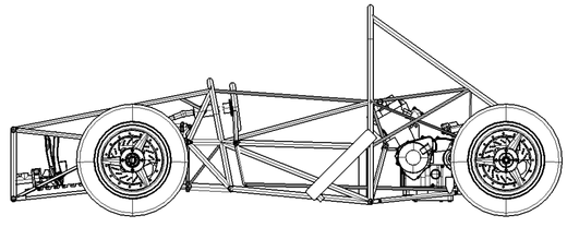

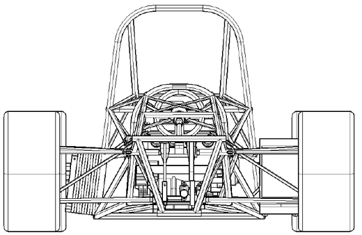
The old saying goes “A picture is worth a thousand words”. I expect to see line drawings. I expect to be able to see how the car works, to see the load paths and how forces are reacted. I expect to see a title box telling what the team or car number is and I expect to see some major dimensions like length, width and height.
I want to see enough detail to see how the car works and I do not want to be overwhelmed by excess detail or dimensioning. I want to be able to blow up the drawing to inspect some small detail (Something that works well with a .pdf document as long as the original drawing is sufficiently detailed) without raster errors making the drawing jagged and illegible.
There is no need to draw a driver in the car. We know there is one and the inclusion only clutters up some of the detail.
I do not want to see rendered illustrations from a solid modelling program. I do not want to see low resolution .jpg images and I certainly do not want to see ‘Artists impressions’ of the finished car. DRs with illustrations like that immediately get tossed into the ‘also ran’ folder!
Teams do not seem to understand that often the judge has to deal with perhaps 100 DRs and in my case, I print them off and bind them in a book along with the Specification sheets. This means almost 500 sheets printed double sided. For time and economy reasons I run them off on a B/W laser printer. Can you imagine how much detail is legible in a black muddy print from a lo-res messy .jpg file? That’s right… nothing!
If you were a judge, which would you rather judge?
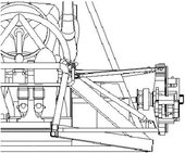
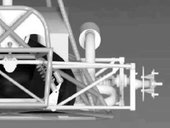
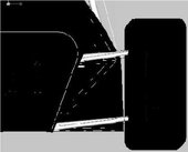
What I do like to see is an isometric line drawing of the car as one of your free illustrations, as that helps me envision what you are doing. The other free drawings should show the judges interesting aspects of your design. Do not just fill the document with pictures because you can. We do not need to see a posed team shot outside the University building. We can see the team posed in the Design Finals if they deserve to be there.
On the topic of illustrations, I have no objection to illustrations highlighting technical aspects of the DR. As mentioned earlier, a picture is worth 1000 words. How much did the judges learn from this illustration?
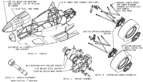
Use your Design Report carefully. It could actually win the event for you and, if nothing else, makes the DR a document you would be proud to append to a CV in a job application.
Design Error of the Month
I mentioned above that I have preached about the requirement for a good Design Report many times in the past. Nearly as often as I have been critical of Rod Ends in Bending, Compliance Steer and convoluted load paths!
Imagine my annoyance when I saw this at the recent FSAE event in Michigan.
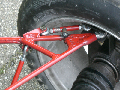
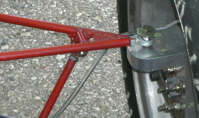
And, you know the worst part? When I raised the issue with the team, the response was “Yeah, we know that but we did it anyway”.
Sometimes I just walk away shaking my head!
Until Next Month, keep safe


